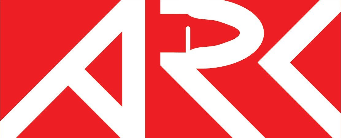
Rebrand
ARK: Survival Evolved
Introduction
For this project, I redesigned the logo for ARK: Survival Evolved, the game. Described as an open-world survival multiplayer game, ARK: Survival Evolved was developed by Instinct Games and published by Studio Wildcard. Players are encountered to explore the mysterious island overrun with dinosaurs, and learn to survive alone the way. This game includes player-vs-player combat as well as player-vs-environment.
I utilized Procreate for a large portion of my preliminary sketching process, and completed finalized iterations in Adobe Illustrator. By gaining insights and help from the player community, I aimed to design a new logo that the fan base would enjoy as well.
Rationale and Brand


Rationale
For this project, I chose to redesign the logo for ARK: Survival Evolved, the game. Although I enjoy playing video games, this game was a huge disappointment for me. Despite the fact that I enjoy FPS and combat games and I have always liked dinosaurs growing up, this videogame had so many issues when I played and was incredibly glitchy. Not only that, but the community was very hateful at the time. Although I personally do not appreciate the game anymore, I do respect anyone who plays and enjoys the game, recognizing that everyone is different and we all experience things differently. Video games are subjectively fun and at the end of the day, it only matters to each individual person.

Brand Introduction
Described as an open-world survival multiplayer game, ARK: Survival Evolved was developed by Instinct Games and Published by Studio Wildcard.
"Stranded on the shores of a mysterious island, you must learn to survive. Use your cunning to kill or tame the primeval creatures roaming the land, and encounter other players to survive, dominate... and escape!" (Steam).
Research

For my first plan of action, I created questionnaires for my audience. One survey was for individuals who played ARK, and one survey was for people who play videogames in general.
For the surveys, many of the responses surprised me and provided me with great tips on the direction that I wanted to go in.
The ARK: Survival Evolved survey answers also gave me clear insight on how the community views the current logo and branding.
Feelings towards the colour palette of the original logo:
"The colour palette is pretty weak overall and the logo is just meant to mix both archaic ideas and new technologies, that being said those colours relate directly with three obelisks present in the game that are needed for certain mechanics in-game, such as server hopping, technology development and for story purposes, they are also the first and easiest way to orient yourself and as such they play an important role in many different aspects of the game."
Feelings towards the font of the original logo:
"not amazing, but serviceable for what they want it to do"
"Feels almost like 'technological runes', unfinished letters yet with the modern roundness and 'screen' feel to it"
From games that you play, do you feel a sense of excitement when you login?
"Yes, especially with Genshin Impact, it gives an entering a portal sort of feel right before you begin to play the game"
From these answers, I was able to understand the importance involving someone's first experience with the game's logo (in a store, ad...)
Research Plan
I gained research about this game and its community's feelings surrounding it through three different means:


Personal Exploration: my own personal research
Online Resources: evidence found online and within community threads
Primary Sources: information taken from primary sources like surveys and verbal opinions.
Research, Personal Exploration
On my own, I took a closer look at some of the game art that has been heavily used in the advertising and branding of the game.
I took away key themes like adventure, high-stress fighting and combat.
I also took note of some of the iconic imagery I saw, including the types of dinosaurs, guns, and landmarks shown. The large monument with the light beam coming out of it also jumped out to me.
Research, Online Resources
Using online forums for one of my sources, I was able to hear some raw and unfiltered opinions about the game and the fact that it isn't super successful. Beginning my search, many people have expressed their opinions on why the game isn't popular, relating to its graphics and PC requirements specifically.
"the game is a buggy mess, the developers are evil, and no one should ever play it"
(ARK: Survival Evolved Ruined My Life)
"The first several hours (or more realistically, several days) of Ark is all about establishing basic needs."
(ARK: Survival Evolved Ruined My Life)
"Ark is a primitive world inhabited by semi-scientifically accurate dinosaurs that can be tamed, trained, and used to further any number of personal goals"
(ARK: Survival Evolved Ruined My Life).
Research, Primary Sources
As I became more familiar with the game and what the community liked and disliked, I needed to get more familiar with what gamers prefer involving game branding and logos. I used surveys and questionnaires to answer some key questions when it came to how a brand identity effects its users.
In order to "design with" the community that I was aiming for, I wanted to interact with them in multiple ways. Throughout this process, I gained feedback using multiple platforms and media. I gained knowledge about how games feel about brand identity in general, as well as people who have played ARK Survival Evolved specifically. I was able to understand the issues involving the original logo, as well as some useful feedback on the logo that I was making, as I was in the process of iterating and making it.
ARK Survey Responses
The feedback I received for the ARK: Survival Evolved survey helped me understand the most important aspects of the game which stick out to players.
Key Themes that relate to the game:
"Adventure, Exploration, Action, Management"
Key points of the most interesting and enjoyable parts of the game:
"Exploring different environments"
"Growing your collection of dinosaurs... [and] using them to expand and get better gear"
"Progression from zero to hero is quite nice"
Summarized general thoughts about the game:
"Setting is engaging and fun especially with friends"
"Exploring the different maps is pretty fun"
"...you are at the mercy of other players even when logged off which means creating a source of anxiety in your daily life"
General Game Survey Responses
As for my secondary survey involving how branding effects how players perceive a video game, I found other insightful tips to weave into my project.
When looking to purchase a new game, how important is the game's overall branding? How does it affect your choice?
"[I believe] a logo of a game should tell or give a hint to users on what the game is about"
"If I can not tell what the game is about from it's branding... it immediately turns me away from the game"
In this same general survey, I introduced my participants to a couple colour schemes to get their reaction. Does it work? Does it not work?
ARK: Survival Evolved original colour palette:

Statements on colour palette:
"It's too muted and low energy"
"I would expect a game with those colours to be about farming, resource management or lifestyles with no real pressure or deadlines"
"Tones of the colour do not seem to go along with eachother"
"The blue and green have a more dull tone but then the orange looks a bit vibrant and stands out more than the blue and green"
"It feels like a lot going on with the colour palette and gives more of a crazy vibe"
"Blue and green seems to represent earth while the orange seems random"
"Not to expect anything too long or complex"
In this same general survey, I introduced my participants to a couple colour schemes to get their reaction.
Proposed color scheme for rebranding:

Statements on colour palette:
"It works really well and feels very clean"
"The orange does not seem as vibrant as it was [in the original palette] and somehow blends in with the darker colours."
"To me this palette gives a dark feeling with the blue and black and then with the orange slightly standing out."
"I immediately feel like this game would have action or stealth involved in it"
This feedback gave me a clear answer that if I went with this palette, it would work better than the previously used one, and communicated more clearly some of the potential themes in the game.
Process
After gaining pivotal insights on the ARK community, I now felt confident that I could do justice to the rebranding project. Here is when I began iterating my logo design.
Visual Research, Phase 1
I began by experimenting with a singular typeface, in order to get a better understanding of what shapes I could make and how I could connect the letters together. Because this brand's name is only three letters long, I could experiment with ideas that would be more complicated for a brand with a longer name.
I experimented with a new colour palette, because from what I've seen online already, many people dislike the original design's scheme for being too bright and saturated.


Visual Research, Phase 2
Using the information taken from my research, I based a couple of my iterations off of the large monuments seen in some of the game imagery.
I also began to simplify some of the shapes in the letters, in order to potentially create a logo that gave the feeling of "primal" and "futuristic" at the same time.

Visual Research, Phase 3
Similarly to phase 2, I heavily took inspiration from banner art and from the themes that I had previously dissected.
Here was when I mainly began to incorporate themes of jurassic and primitive fighting(bones, scratch marks, claws...), as well as modern fighting involving guns.

Visual Research, Phase 4
After receiving feedback on my previous iterations, I needed to begin to simplify some of the forms I had, since they were becoming too complex.
By having a cleaner logo, it would be easier to integrate it into multiple contexts for the branding(a standalone logo, vertical/horizontal, on merch...).

Visual Research, Phase 5a
After cleaning up my most favoured design in Adobe Illustrator, I explore how I should get illustrate the bullet within the "R". Since the logo could be in a context where it is seen from far away, I had to make sure legibility stayed clear.

Visual Research, Phase 5b
I also made sure to explore other options for forms within the "A", but found issues creating clarity on what they were from helpful critiques.
I decided not to choose to add the claw as I found it took away from the legibility of the design overall.


Visual Research, Phase 6a
With in-class feedback from classmates, they found the bullet was difficult to see. They suggested making the bullet smaller, extending it through the "A", or changing it for a spear tip.

Visual Research, Phase 6b
Additional feedback suggested adding the back lip to the bullet along with more length. Although this made the bullet become more obvious and accentuated, it took away from the consistency of negative space.

Visual Research, Phase 6c
After finding a successful silhouette, I wanted to see if adding more details could help make it easier to see and understand.

Visual Research, Phase 6d
I loosely based some of the iterations off of a common bullet type features in the game; an advanced rifle bullet. This included adding details like crosses and metal seams.