Infographic
Refractometer
Introduction
This project involved the creation of an infographic on an object, including steps on how to user it, and other necessary product details. I created the model on spline.design, and created the layout using Adobe Illustrator.
The choice of a refractometer as my object was based on multiple factors. One reason was that it isn’t a common object so it would be even more of a challenge for people to follow the steps, as it’s a completely new experience for them. This would challenge me to make sure I bring complete clarity to every detail of the graphic.
What is a refractometer?
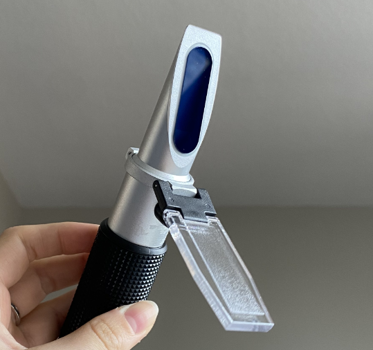
A refractometer is a handheld device that measures refractometry of liquid substances. In the context of aquariums, many hobbyists use it to measure the salinity of their tank water. This helps guarantee the health and safety of your tank and its inhabitants.
Drag the interactive model to see all angles of the object!
Target Audience
Process

The target audience of my infographic is primarily aimed towards those entering the hobby of saltwater aquariums, saltwater fish and coral keeping, and saltwater aquascaping. This infographic is designed to help simplify a normally complex and intimidating product which is required in order to properly maintain and take care of a saltwater tank. As someone who has dabbled in this hobby myself, I could personally testify to how overwhelming the hobby can be to get into, as there are many working parts which must run smoothly.
As for the job of a refractometer, it determines a crucial element in the success of a saltwater tank. With salinity levels that are too high or too low, you risk the health and survival of your entire tank ecosystem. For some, this could mean hundreds of dollars worth of tank equipment and livestock.
Making sure I keep this in mind, I needed to make sure I kept in mind the specific environmental conditions that this infographic would be present in. For the web, it would most likely be a focal piece on a website product or sales page. For print, it would be located on a wall of an aquarium store. Considering this I needed to guarantee it could be legible from far away, but also had to make sure the colours were saturated enough to stand out while under vibrant coral lights which tend to be bright blue or purple.
Overall, the demographic of aquarium-keeping in the current age could be anywhere from 20-40 age, mainly young adults wanting to experience a new hobby, or parents who want to set up a tank for their young children.

Context and Environment


Going into a project that requires web and print outputs, I realized how important is it for the infographic to be able to look clean within the environment it will be presented in. For a refractometer, this would be usually be a specialty saltwater hobby store. Prior to getting too far into the project, I traveled to multiple locations that I associated with my target audience. This included Candy Corals, Fragbox Corals, and Big Als.
As I visited various located, I took photos to note of store light levels and conditions which I would reference later.
Elements that I had to keep in mind that were specific to the context of my topic of saltwater aquariums included light levels of the stores as well as the colour of lights.
As I explore various stores located in the GTA, I observed many stores that had lower light levels than the average retail store. This is mainly to allow coral grow lights to be the main focus for customers, and let people observe the true vibrant colours of saltwater fish, anemone, and coral. This was an important note, as lower levels with low contrast could possibly result in text that is illegible or not visible at all.
Many specialty saltwater hobby stores sell collections of anemone and coral. As corals require specific lights designed for optimal growing, many tend to be a saturated purple or blue colour. Although this ranges and depends on the specific store, this was something I had to make sure I considered throughout my process.

After gaining feedback from self analysis and other peer perspectives, I chose a roster of final options to narrow my scope. These colours again helped push the feeling of deep sea experience and aquatic adventure, while still holding a modern and scientific theme.

Physical Object Research
After getting my hands on a refractometer, I was able to better outline parts of the object that were more important for users, as well as parts that I found could be visually interesting to experiment with or highlight. At this point I also began thinking about using 3D software to model the centerpiece image in my infographic. Holding the object allowed me to have a better sense of proportions and dimensions.
I also took this chance to go through the process of using it, giving me time to take notes and pictures of the process.

This helped me start mentally planning which were the crucial steps that I wanted to highlight. It was also very helpful to watch the cleaning process, as this will be an important step to mention in the infographic. Not thoroughly cleaning the product will slowly lower its quality overtime.


Preliminary Models
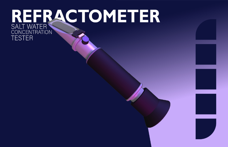
I began the modeling process and slowly began adding shapes to my component. I made sure to add round edges to all of my object layers to replicate a soft look while still being true to the real refractometer.
I made sure to consider the file size of my model, having as few polygons as possible while still keeping it high-quality. I wanted to keep the ability to have a smooth interactive display if I chose to export my spline file.
Light Experimentation
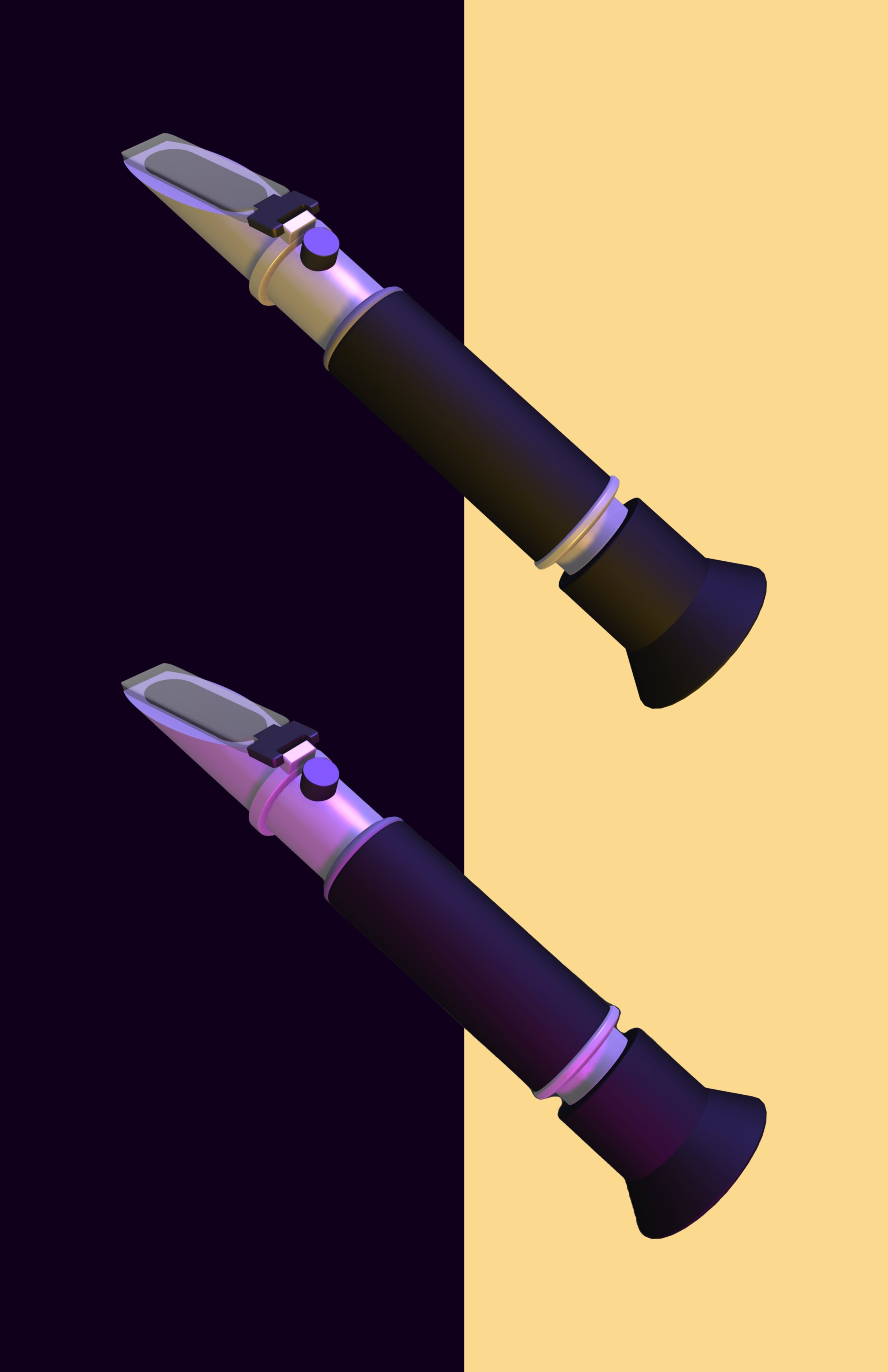
After completing my model and assigning realistic materials to each asset layer, I immediately began experimenting with lighting and composition. One of my first favourite light iterations was a yellow and purple light. This colour choice was inspired by my environment exploration from in-person stores. I also wanted to see how layering multiple refractometers would look, but realistically this option wouldn't work once I had to implement legible labels. This did spark an interest in implementing more than one angle of my model in my design.
After experimenting more with Spline's lighting and rendering features, I finally settled on a colour combination that worked.
I chose a vibrant magenta and purple to highlight different features of the object. I also was able to use the lighting angles in order to accentuate edges of the model that seemed to disappear with a darker background.
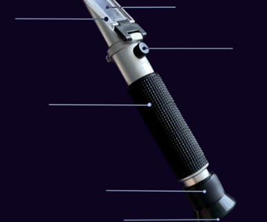
Now I had a completed model finished, I began experimenting with how I could go about labeling.
Label Studies, Direction Exploration
As I took inspiration from other product posters and designs, I experimented with different labelling methods. Due to the placement of components I needed to label, some would be very close together while others would have a significant space between them.
I drew from inspiration from other infographics, specifically an instance where a videogame console controller was labelled which had many part to it. Despite it having many parts to it, the technique which was used for labelling still made it visually appealing, concise, and understandable.
These first attempts made to label involved more intricate and pivoting lines, which felt chaotic and unorganized. This experimentation helped me eliminate this as a possibility.
I found that as I experimented more with straight vertical and horizonal lines, the object itself became more appealing. Instead of focusing directly at the labelled pieces, your eye is drawn to the object and then the labels.
Now that I had an idea of where I wanted to go with labelling, I could begin layout iteration exploration.


Colour Studies, Exploration
While choosing some colour combinations in my process, I made sure to aim to get a broad variety of options. Although I mainly stuck to a dark and light colour to mesh with one another, I wanted to get quantity or quality to completely exhaust my options.
I also made sure to display my process work together and separately, guaranteeing that I get a proper perception of the colours and how they directly work together.
Colour Studies, Favourites


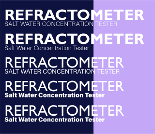
I made my type studies based on my chosen colour palette. Through this experimentation, I found that serif fonts did not work as well as stronger san serif typefaces. Serif fonts felt weak at points, and also did not benefit the overall feeling that I was aiming to communicate
I felt naturally drawn to many of the boldest san serif fonts, as they helped match the feeling evoked by the rigid form of object itself.
Type Studies, Exploration
The final type I chose for my concept was bold Gill Sans MT. I found this font to be the most attractive font of those which I tested in my type studies.
I also chose Acumin Variable Concept(thin) for the subtitle text. This was one of few fonts that was still legible at a thin font-weight, and visible at a distance.
Type Studies, Chosen
A preliminary colour palette I thought could work was a light blue, vibrant red and midnight blue/purple. The feelings that I associate with this relates to technological and futuristic products and design.
I also had to keep in mind the environmental context of where the target viewer would be while viewing the infographic, which would likely be in an aquarium store or coral store. This helped me determine that this palette would not be a potential as these colours wouldn't be legible.

Colour Palette, Rough

Another palette which I developed leaned more into vibrant blue, pink, and purple colours, as they fit into the "under the sea" theme which would be prevalent in aquarium stores.
This also worked well with the light rendering colours I had already used, so it worked well.
Colour Palette, Finalized


In the second image, I found this was the first successful composition which had potential, as it could fit all aspects required for the brief; including a labelled diagram, detailed but concise steps, and an eye-catching title.
the infographic prior to the implementation of steps was very rigid with few organic curves and shapes. After including curves on the step boxes, I found that it helped loosen up the design and make the object silhouette seem less jarring. I also was recommended to push the step images flush to the edge of the canvas to add to my iteration, and found that it worked better than I would've assumed. This helped me break down some of my expectations of the design and challenge myself more for what the potential of the poster had.


Label Studies, Line Exploration
While considering colour scheme, it was very important to also consider label line colour and thickness. There is a balance I had to find between too thin and too thick, which could still be visible from far away. I also had to make sure to choose colours that could have high contrast on a lighter and darker background, as my top chosen colour schemes had both.
I found that a medium thickness was what worked the best, with a light colour like pastel pink or white.

Layouts, Developing the Composition
While utilizing the "under the sea" colour palette, I began the gathering prominent shapes and forms I could potentially work with. In the first image, I first began to play with how I could utilized the bold font I chose in the design itself, and how I could help promote the use of the object with other faucets of the graphic. Although this idea could've been successful for a different design brief, it did not work compositionally as the labelled steps would have nowhere on the page to fit.
Layouts, Working on Steps
As I worked on the steps for my infographic, I broke them down into 5 main elements. I summarized each step into one word title, as an attempt to help simplify the process and make it more memorable for frequent users of the tool. The steps included "Clean", "Add", "Press", "Look" and "Read". I also made sure that each summary of the step was typeset to guarantee they felt uniform in length and hyphenation, while still included the most useful information required for viewers to understand the steps.
As for the shapes of the step boxes, I curved many of the iterations to mimic the curvature of the bottom lens on the object. The overall design of

Layouts, Label Alignment
An obstacle involving the labels of the more developed layouts was deciding whether to align the lines of the labels which eachother on a line, or choosing to align the end of the words of each label. In the images above, the red lines represent my idea of where I wanted to cut off each label. I chose this position as it created a sense of flow and visual loop through the design, carrying the eyes from the title, to the object, to the steps, and then back up together the title through this movement line to make viewers review what they just viewed.
I decided that the alignment of the label lines felt stronger than aligning to the words, as well as it felt more intentional.
Layouts, Step Repositioning
This was the transition I made in the design to split up the steps in order to help aid the overall distribution of elements of my graphic. I first began by keeping the steps to the top-right and bottom-left of the page, but found that keeping them raise to underneath the subtitle didn't leave uncomfortable whitespace.
Although I resolved one issue, the infographic still felt incomplete at the bottom half of the page.


Layouts, Final Edits
For the final layout, I added two more elements to the page to make it feel resolved and complete. The specifications tab was placed at the bottom left of the graphic in order to provide users with necessary information regarding the specific product's measurements and accuracy. I also added the product rating of 4 stars to the bottom right corner in order to fill the space and potentially help attract more viewers to inspect the graphic overall.
