Alternative Book Cover
Six of Crows by Leigh Bardugo
Introduction
This project involved the creation of an alternative book cover design for Leigh Bardugo’s book Six of Crows. This book is a fantasy novel based in what is known as the Grishaverse, a fictional universe created by the author, Leigh Bardugo. As the first book of a duology, it has high expectations from readers coming from the Shadow and Bone collection, so the cover must be compelling enough to lure in eager readers.
Design Statement
Six of Crows is aimed at young adult readers and covers the themes of vengeance, trauma, and the fight for power. These themes are represented through the revolvers on the front cover, signifying not only the physical conflict which happens in the book, but also the emotional conflict happening within the characters. This is done using a metaphor.
Communicated through the placement, colour, and texture of the guns, the metaphorical idea of internal turmoil and conflict is specifically highlighted. The three guns featured on the cover are all pointed at each other. The colours used make the red jump out at the view, representing crime and violence. The gritty texture also adds to the messiness of the story and confusion which occurs within the characters.

Front cover

Back cover

Extended book cover
Preliminary Concept Exploration
Process
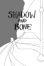
Beginning this project, I had settled on a book series that I wanted to redesign a cover for, but was still deciding the the particular book from the series. I begin my process by exploring ideations for Leigh Bardugo’s Shadow and Bone book, but eventually pivot to Six of Crows.
The sketches which I explored mainly involved the book's world map of Ravka, as well as the infamous landmark, The Fold. There are iconic scenes which jump out to me from the book which I wanted to incorporate because the significance they have to the plot. I did not choose to decide on type at this point.
Knowing that I would eventually develop an augmented reality asset later on in the project, I kept that in mind. I chose ideas that could show explorative depth in a 3D environment.

This was where I understood that I wanted to continue the project with this concept. Although I encountered limitations on executing a 3D cover for this project, this refined conceptualization helped me better explore the possibilities with using depth and layering techniques.

Layout Exploration, Round 1
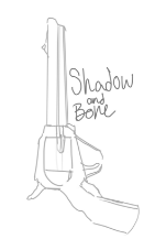
During my first round of formstorming concepts for my book cover, it took me a while until I got into the groove. I wasn't confident in my designs until I began to play with the idea of a revolver. In the Grishverse, there are two main weapons of choice; guns or magic. With the incorporation of the revolver, I put more significance on combat from the storyline, in hopes of tailoring the content to the specific fiction, fantasy, and action communities.
After including the revolver sketch, I also found it easier to play with text. As I used it as a base, the gun began to jump from the background into the foreground.


I also included a rough plan of what my complete book sleeve would look like, and how I could leverage the extended surface in my design.

The final feedback which I received before going into cleaning up my project output majorly pushed me to make important decisions which I had been avoiding for multiple rounds of iteration, the gun illustration itself.
I found that I tied myself too strictly to this drawing, without giving it more thought. In my final cover concepts, I explore this illustration further.
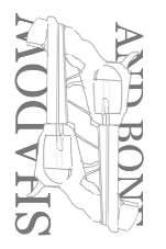
The three layouts shown below were the final iterations I played with before deciding on my final concept. Although I enjoyed the yellow background layout, I found that it was harder to tell the genre of the book. I often associate yellow with mystery or crime books.
The layout featuring a red fill was my favourite out of the three schemes.

Layout Exploration, Round 1: Feedback
I took input from my peers and classmates of what their first impressions of my favoured design were, and how they could interpret the concept in different ways.
These are iteration ideas which I took note of:
Make one gun into a Grisha hand(metaphor for the conflict in Ravka)
New angle of gun and hand, would allow room in project 2 to have train coming out of gun barrel(simile for gun barrels being tunnels
One gun shows the Ketterdam skyline, displaying the crime which happens there which has a huge play in the plot of the story
Create a kaleidoscope effect with small guns
Layout Exploration, Round 2
Here is further iterations from my second round of progress. My exploration includes both overall layout, as well as type studies. Through many rough sketches, I can implement feedback and formstorm with quantity over quality.


Feedback Takeaway


Layout Exploration, Round 3
Here is further iterations from my third round of progress. I also continue to implement feedback from previous review sessions.


Layout Exploration, Round 3: Feedback
Below are the chosen iterations which I deemed to be the strongest, from the selection above. These were what I shared in my find round of feedback.


Layout Exploration, Round 4
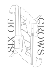
Once acknowledging the pitfall of my previous illustration, I redid the design and created a different style of illustration while still using the same subject.
I created this illustration by simplifying a photograph of a revolver and limiting it to three colours.

Layout Exploration, Round 5
To complete my layout, I designed the back cover, spine, and flaps further. I added in a bar code to finalize the realness of the book cover. I decided to offset the red gun silhouette to give a less clean finish to my cover, as I found that the alignment of the text needed contrasting chaos.
I also utilized Leigh Bardugo's iconic Grishaverse logo, featuring it on the spine and on the internal flaps in a low-contrast repeating pattern.


